
Just like building a house requires a blueprint, great visual design starts with a plan, and a strong brief gives your designer everything they need to bring your vision to life. Clear design instruction reduces back‑and‑forth, keeps budgets happy, and ensures a result that actually meets your goals! Keep reading to learn how, plus download a handy checklist at the end of this blog.
Start with the Big Picture
Before we start pulling inspiration images or opening up Illustrator, designers need to understand the why behind the project. What are we actually making, and what’s its intended purpose? Is it a flyer for a one-time event, an ad for social media, or a whole new brand identity?
It’s also important to know more about your target audience. Are we talking to new customers? Loyal clients? Gen Z or working parents? Assessing your audience helps us make choices around layout, tone, color—every design element!
Bottom Line: The more context you can give up front, the faster we can get to a design that actually works (and the fewer rounds of revisions you’ll need)! Knowing what success looks like helps us design with intention.
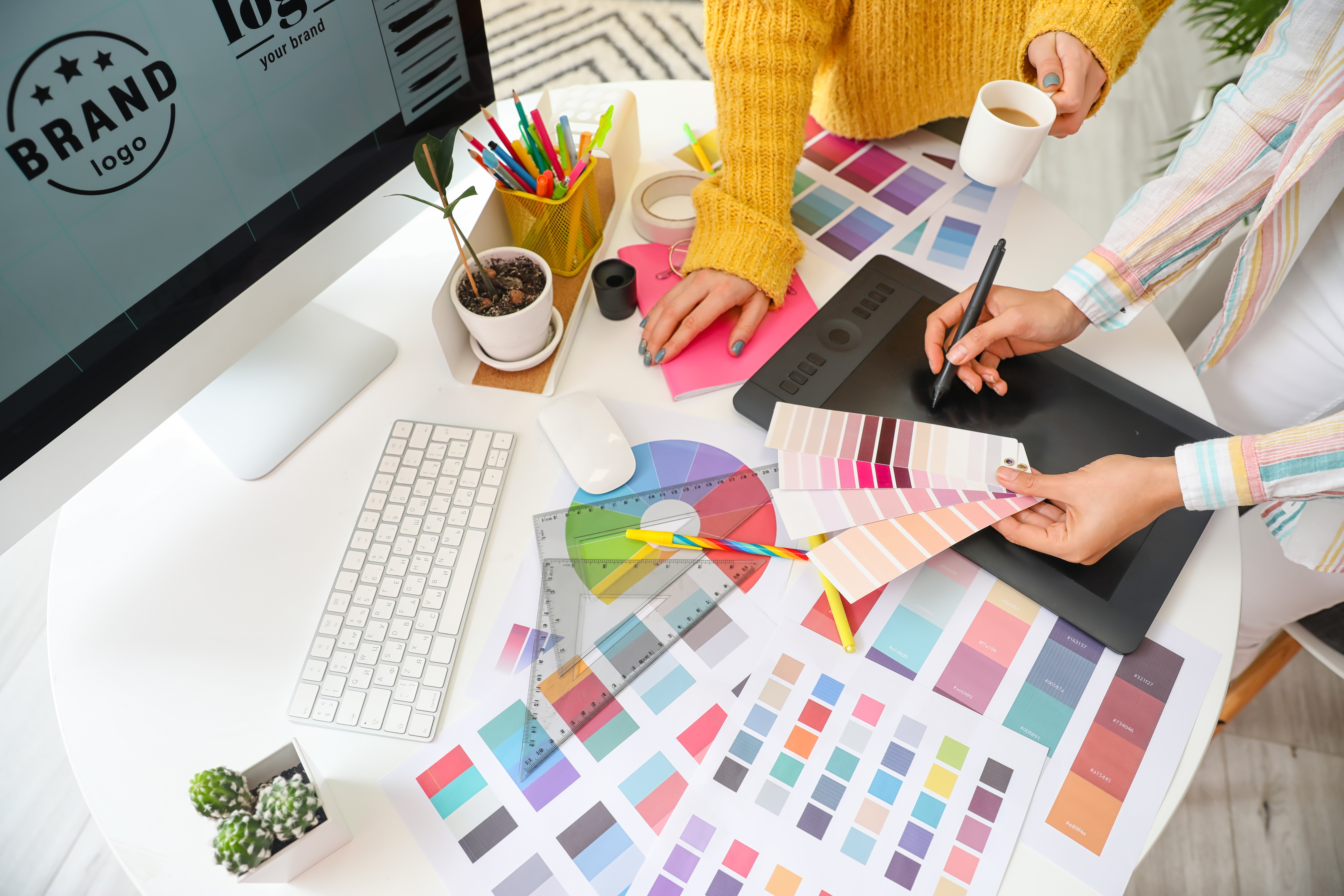
Brand Details Matter
Once we understand the big picture, the next step is making sure your design looks and feels like your brand. That means giving your designer the right tools up front—otherwise, we’re shooting in the dark!
Here’s what we need:
- Your Logo - Ideally in a vector format like AI, SVG, or EPS. (JPGs get fuzzy, and nobody wants that.)
- Brand Colors - HEX codes for digital, CMYK for print. Bonus points for a palette with primary and secondary colors!
- Fonts - Let us know what you use, or share files if you have custom typefaces.
- A Style Guide - If you’ve got one, send it over! If not, even a few examples of what’s on-brand vs. off-brand can go a long way.
You don’t need to have a fancy brand Bible to get started, but the more you can share, the better we can design something that feels like you.
Pro Tip: If you’re feeling like your brand’s visual direction is all over the place, that’s a sign it might be time for a refresh (and we’d love to help with that)!
Content Matters
Design needs words to inform it. Hand over the final copy (or a well‑marked draft) so we can put together layout, hierarchy, and spacing in a way that fits!
What to include:
- Headline, body copy, and CTAs
- Images and logos
- Legal or compliance lines (better early than forgotten)
If possible, give us the final (or 95%‑final) copy. Text length affects font size, line breaks, and overall balance. Swapping a five‑word headline for a fifteen‑word one after the design is built can domino into a full redo!
However, if the copy is still in review (we know it happens), give us a word‑count target and the gist (“two‑sentence benefit statement here”). We’ll block space so the final edit drops in cleanly!
Main Takeaway: Clear, approved copy up front keeps the design tight, the message on point, and your timeline blissfully revision‑free. If wrangling words isn’t your happy place, Hydrate’s content team is only an email away.
Inspiration and Must‑Haves
Tone and personality cues are also helpful. Think of this like mood-setting for your design. Typeface, color, and whitespace feel totally different for “casual and fun” versus “clinical and precise.” One tip is to drop three adjectives that describe how the reader should feel!
We love a mood board. But we also love a photo of your whiteboard sketch, a random Pinterest pin, or that one Instagram ad you screenshotted at midnight. Anything that gives us a visual vibe or reference point helps shape the look and feel of the final design!
Don’t worry about being too specific. This isn’t about copying—it’s about capturing a direction!
Another thing you can share is competitor examples (what to mimic or totally avoid). Show us who’s doing it well—or who’s missing the mark. This helps us understand the industry landscape, and more importantly, how you want to stand out (or fit in).
Non‑Negotiables: Specific photos, taglines, and icons. Knowing these guardrails upfront keeps us from designing something that can’t actually be used!
Timeline and Deliverables
Deadlines are friendly, surprises are not. Let us know your essential completion date, plus any internal review checkpoints. Confirm file types and sizes, and any alternate versions you’ll need.
Important: Having end‑use specs up front means fewer export marathons and no compression surprises on launch day.
Grab the Free Design Brief Checklist
We turned everything above into a one‑page checklist you can pin to your desktop or print for your wall.

A solid brief turns visual design from a guessing game into a collaborative win. But if wrangling logos, copy, and deadlines makes you feel like you’re in over your head, get in touch with us. Hydrate Marketing lives for turning ideas into attention-grabbing, ROI‑boosting visuals!